The Balletcore Color Palette That Actually Reads as Effortless
Quick Answer: A balletcore palette built around muted blush, dove grey, cream, and soft black anchors reads as effortless, while overly saturated pastels or too much pink in one look tend to tip into costume territory — the key is muting saturation and mixing in neutrals.
Balletcore’s signature is softness, but soft doesn’t mean matchy. The palette does a lot of the work in whether it reads as elevated or literal.
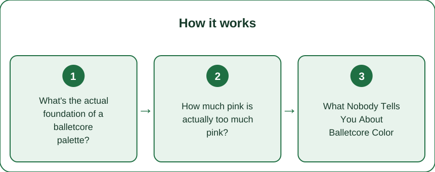
What’s the actual foundation of a balletcore palette?
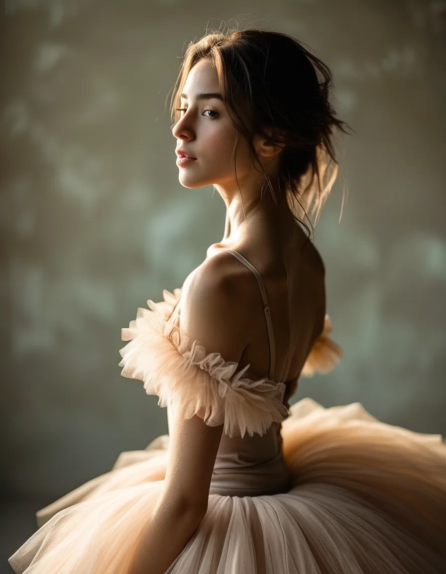
Think muted, not saturated — dusty rose instead of bubblegum pink, dove grey instead of stark grey, cream instead of bright white. These desaturated tones are what separate balletcore from literal dance-costume pink.
A soft black or deep espresso brown works as your grounding neutral, preventing the palette from feeling too uniformly pale.
How much pink is actually too much pink?
One pink piece per outfit, maximum two in muted tones, is a reliable rule — wrap tops, ballet flats, or a cardigan in blush reads as intentional, while pink head-to-toe reads as costume.
Breaking up pink with a neutral (cream trousers, grey knit, black tights) lets the pink read as an accent rather than the entire concept.
What Nobody Tells You About Balletcore Color
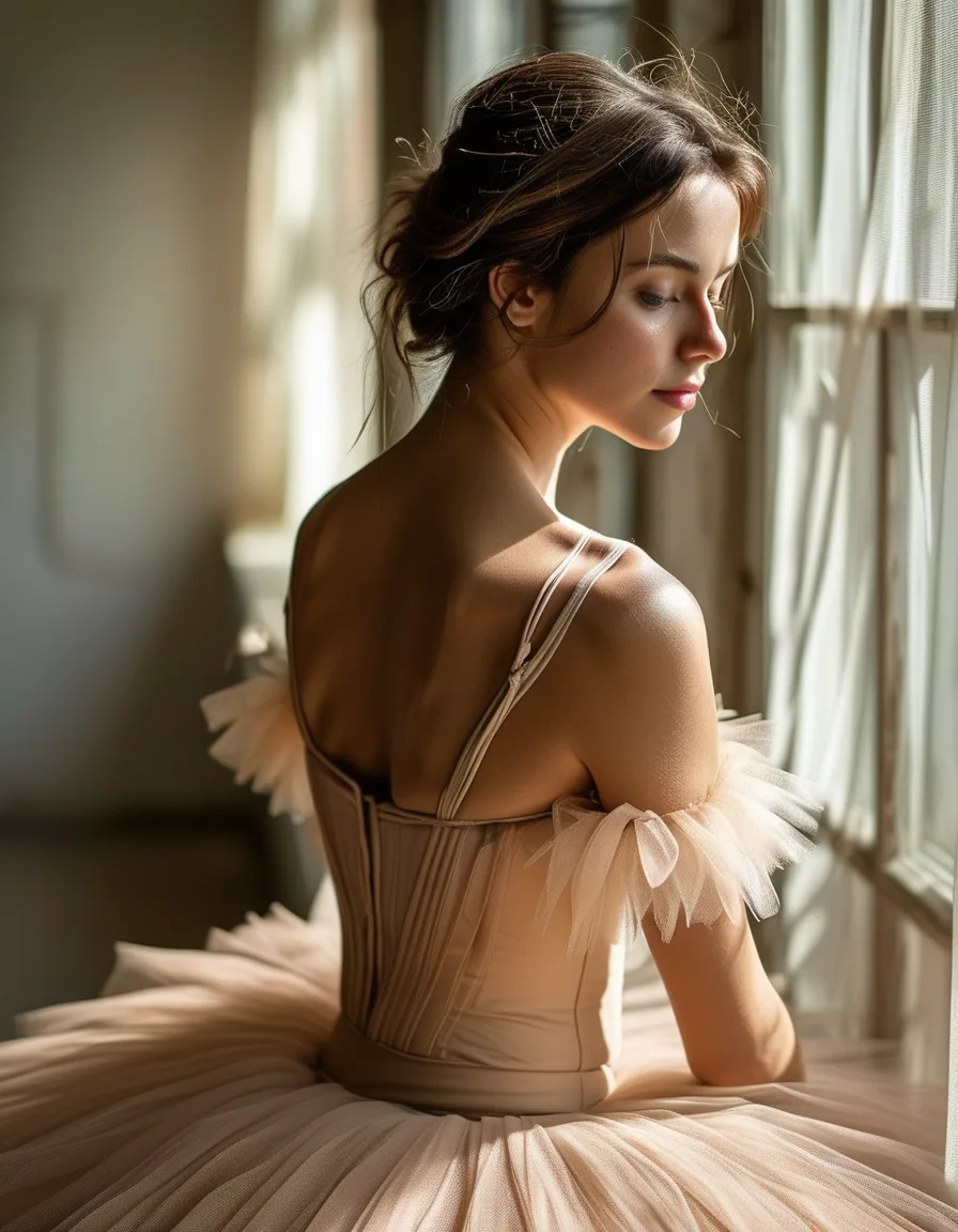
Texture affects color perception as much as the shade itself — a matte blush knit reads sophisticated, while the same shade in shiny satin can tip toward costume, especially in bulk.
Also underrated: warm-toned creams versus cool-toned whites aren’t interchangeable — balletcore generally leans warm (ivory, cream) rather than stark cool white, which keeps the overall look softer.
How do you build a capsule around this palette?
Start with 3 neutrals (cream, dove grey, soft black) and 1-2 accent tones (blush, dusty mauve) — this ratio lets you mix and match without ever looking like you’re wearing a themed costume.
Add texture variety within the palette (ribbed knits, soft wool, light tulle accents) so pieces feel layered and considered rather than flat and one-note.
FAQ: Balletcore Color Palette Questions, Answered
Can you wear balletcore colors with bold prints?
Sparingly — one small printed accessory can work, but balletcore’s core identity relies on the palette staying calm and unbroken by busy pattern.
Are balletcore colors seasonal?
The core palette works year-round, though deeper tones (mauve, espresso) tend to dominate in cooler months while blush and cream lead in warmer ones.
What colors should you avoid in a balletcore look?
Neon brights and very saturated jewel tones clash with balletcore’s soft, muted identity — they pull the look toward a different aesthetic entirely.
TL;DR:
- Muted blush, dove grey, cream, and soft black are the balletcore palette foundation
- Limit pink to one or two muted pieces per outfit to avoid a costume look
- Texture and warm-vs-cool undertones affect how sophisticated the palette reads
- Build a small capsule of neutrals plus 1-2 accent tones for easy mixing
The palette’s restraint is what makes balletcore read as elevated rather than literal.
Keep Reading
This article is for general informational and styling purposes only. Fit, sizing, and product availability may vary.